Bose site branding
Bose recently went through a rebranding effort that touched all aspects of design, including the website. The web design team was tasked with carrying out the vision of the brand through out the site. The brand became more confident in not only presenting the technology of the company but also in showing the humanity behind those innovations. These new pages represent that effort in capturing both sides of the companies personality.
Art Direction / UX

New Design / same brand
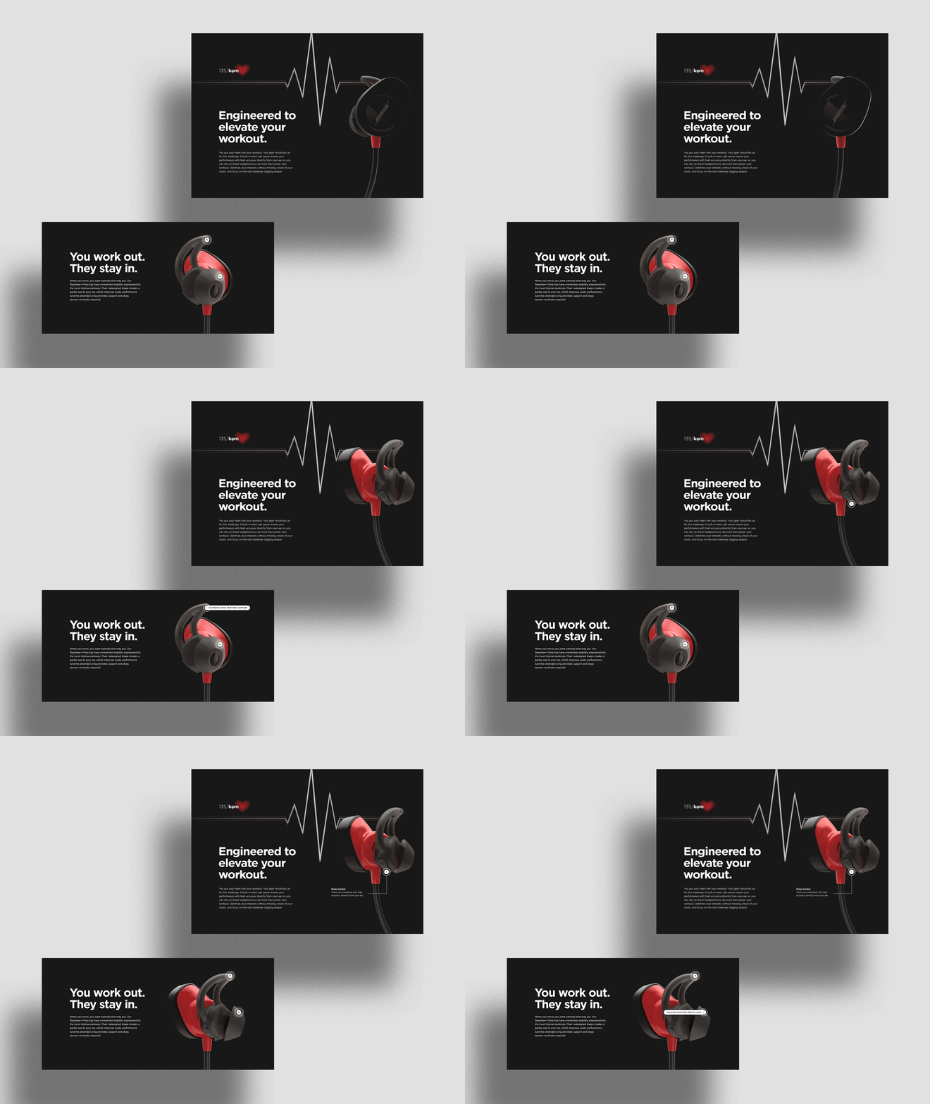
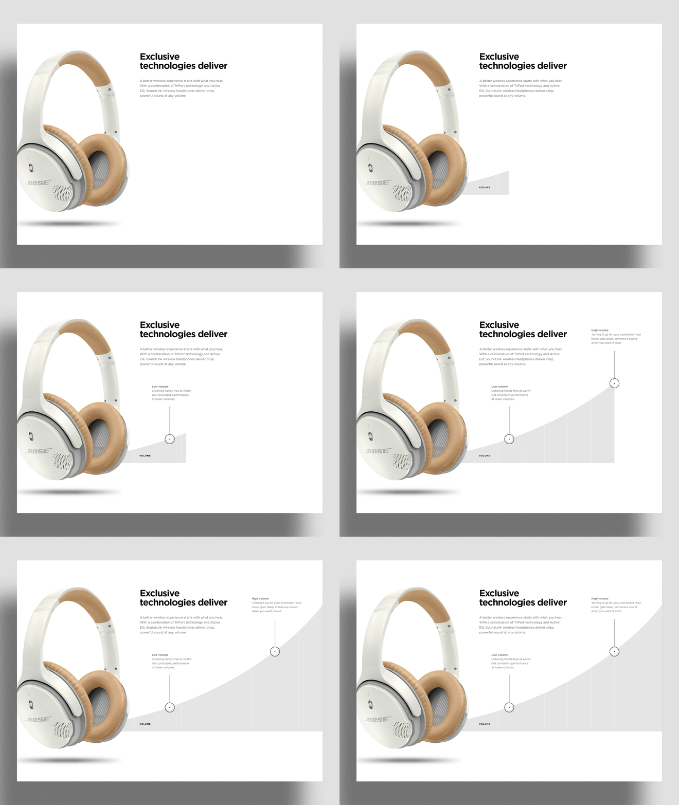
The new design aesthetic had a simpler way of representing the brand and its product pages. With white, black, and tones of gray, products could rest simply on overlapping panels and backgrounds.


Dynamic content
These elements helped create depth on the page and offered spaces where the technology story could be told in interactive ways. Gotham also became the new font and reflected the mature simplicity of the brand.


Category pages
The new design aesthetic also worked well within our category pages where we were able to tell the category story through a mix of situational and silo photography.


Mobile

